 Sorry that I haven't had too many "feature" posts for while. I have some partially completed drafts sitting around in the queue. I hope to have some longer, more interesting posts out soon.
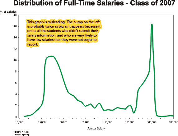
In the meantime, I thought I'd help publicize this well known (though not well enough known) chart depicting the bi-modal distribution of starting salaries out of law school.
I was inspired by a post by Exposing the Law School Scam, which linked to an advertisement by a firm looking to pay an attorney with a decade's worth of experience, $40k!
Yes, soak in this chart 0L's - this is the career you've chosen. Here the "winners" get six figure salaries (and 80 hour work weeks), and the losers get to represent other losers fighting their 6th DWI conviction all while living at the local bus terminal.
Do you think that if you miss the cutoff for working for the big firms at OCI that you'll just "settle" for 80k working for a mid-sized firm? Guess again. You might as well prepare your resume to work for the closest Big Foot sanctuary because entry level jobs like that are equally mythical.


These charts provide a good visual for those considering law school. I am glad that you added your commentary. Because the law schools use these false, misleading charts to attract more law school applicants.
ReplyDeleteWhen law school turns out to be a poor (and often terrible) investment for the majority of graduates, the schools then turn around and blame the student/grad for "not doing enough research." These subspecies of Periplaneta americana then have the nerve to say, "The information is out there." Yeah, but most of it - from the industry - is misinformation.
Thank you for posting this, it's probably the most powerful piece of evidence out there for the case against law school.
ReplyDelete